Modernizing the web experience of the future of assistive technology
ROLE
Web Designer + Developer
TIMEFRAME
Summer 2026
KEY STAKEHOLDERS
Prospective research participants, prospective students, industry partners & donors
SKILLS
Figma, User Research, Webflow CMS
Overview
The Exoskeleton and Prosthetic Intelligent Controls (EPIC) Lab at Georgia Tech is devoted to the design and control of robotic prostheses and exoskeletons.
Problem
EPIC's website hasn't been updated since the lab's founding 10 years ago. Here's how that was affecting each key stakeholder:
Prospective research participants: The patient intake survey was difficult to locate, resulting in zero patient conversions from the website since EPIC's inception.
Prospective students: The site's poor user experience (especially on mobile) drove up bounce rate, and unanswered questions got funneled to lab staff instead of being resolved on the site.
Industry partners & donors: The current site wasn't built with this audience in mind; this redesign presented an opportunity to add clear, dedicated calls to action for them.
Solution
A top-down redesign leveraging Webflow's CMS to organize content into audience-specific pathways, creating clear pipelines across the site so prospective participants, students, and industry partners each reach the information and call-to-action most relevant to them within one or two clicks—all while meeting accessibility standards for visually impaired and older users.
WHAT I FOUND
I started with a UX audit of the existing WordPress site. It surfaced three categories of problem:
Broken mobile layouts
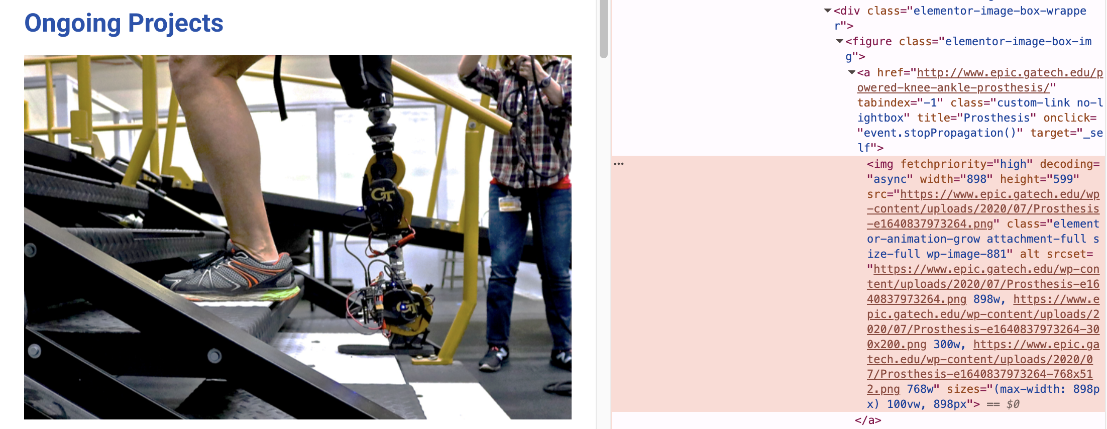
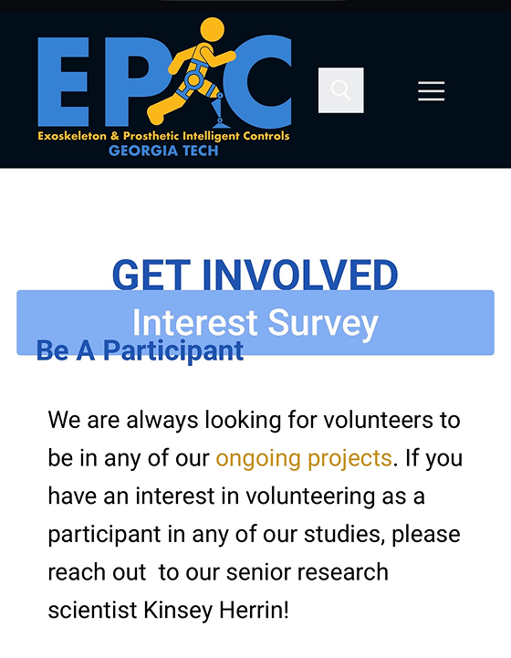
The site had never been optimized for mobile, so the formatting broke across the board. In the first meeting with the client, I flagged the interest survey button as the clearest example: a critical entry point that overlapped surrounding text and didn't read as a button.
Accessibility gaps
Buttons failed WCAG, and images across the site had no alt text. This was especially concerning considering that much of EPIC's work served seniors and disabled populations.
No audience segmentation
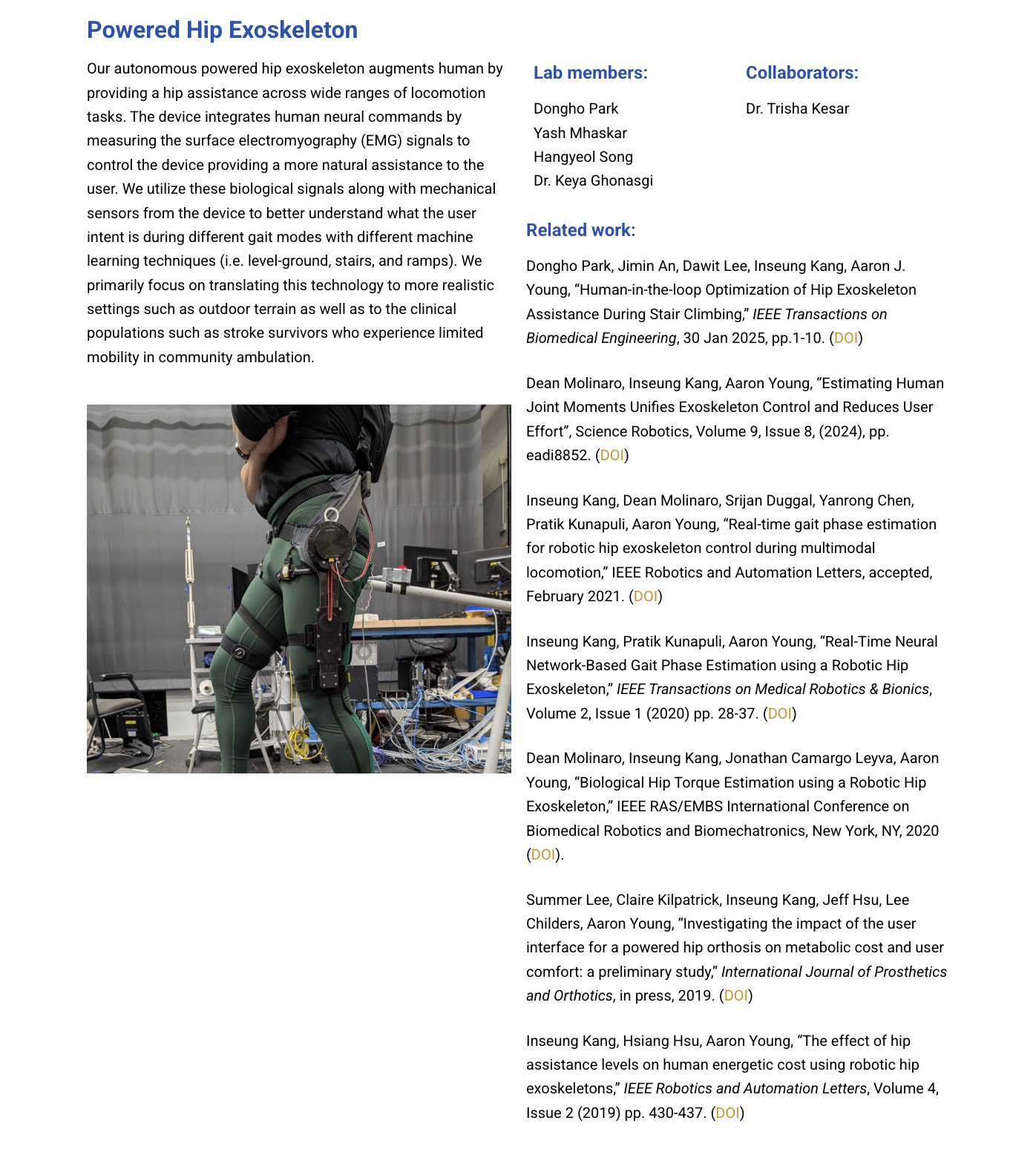
The site was written without a clear audience in mind, so project titles named devices rather than the problems they solved, and the copy assumed a reader who already knew the field.
This problem also made its way into page layouts.
DESIGN DECISION 1
Designing for different stakeholders
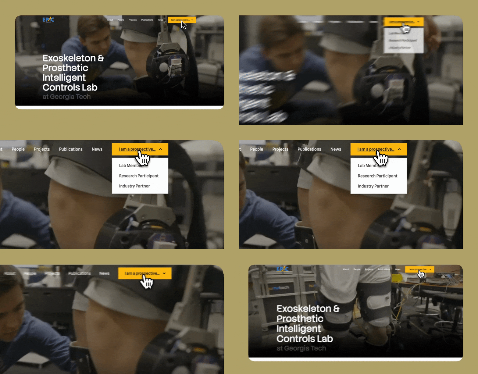
Primary CTA: "I am a prospective..."
Rather than using four buttons in the nav, I made self-identification the primary action. "I am a prospective..." asks the visitor to finish the sentence, which costs one click and replaces a navigation problem with a question people can already answer about themselves. It also let the nav stay a single CTA instead of a menu of them, and it puts recruitment at the top of the hierarchy, where the lab's actual growth constraints are.
Designing around a specific stakeholder
The decision to prioritize prospective research participants came early. The lab's principal investigator and principal research scientist both wanted the site to move away from an academic audience and toward the people who might actually enroll in a study, with the rationale that prospective students and donors would generally be younger and more tech-literate.
Distancing projects from scientific jargon
Early interviews showed participants had little interest in the science behind the projects, which was reflected in a few different ways.
Project titles
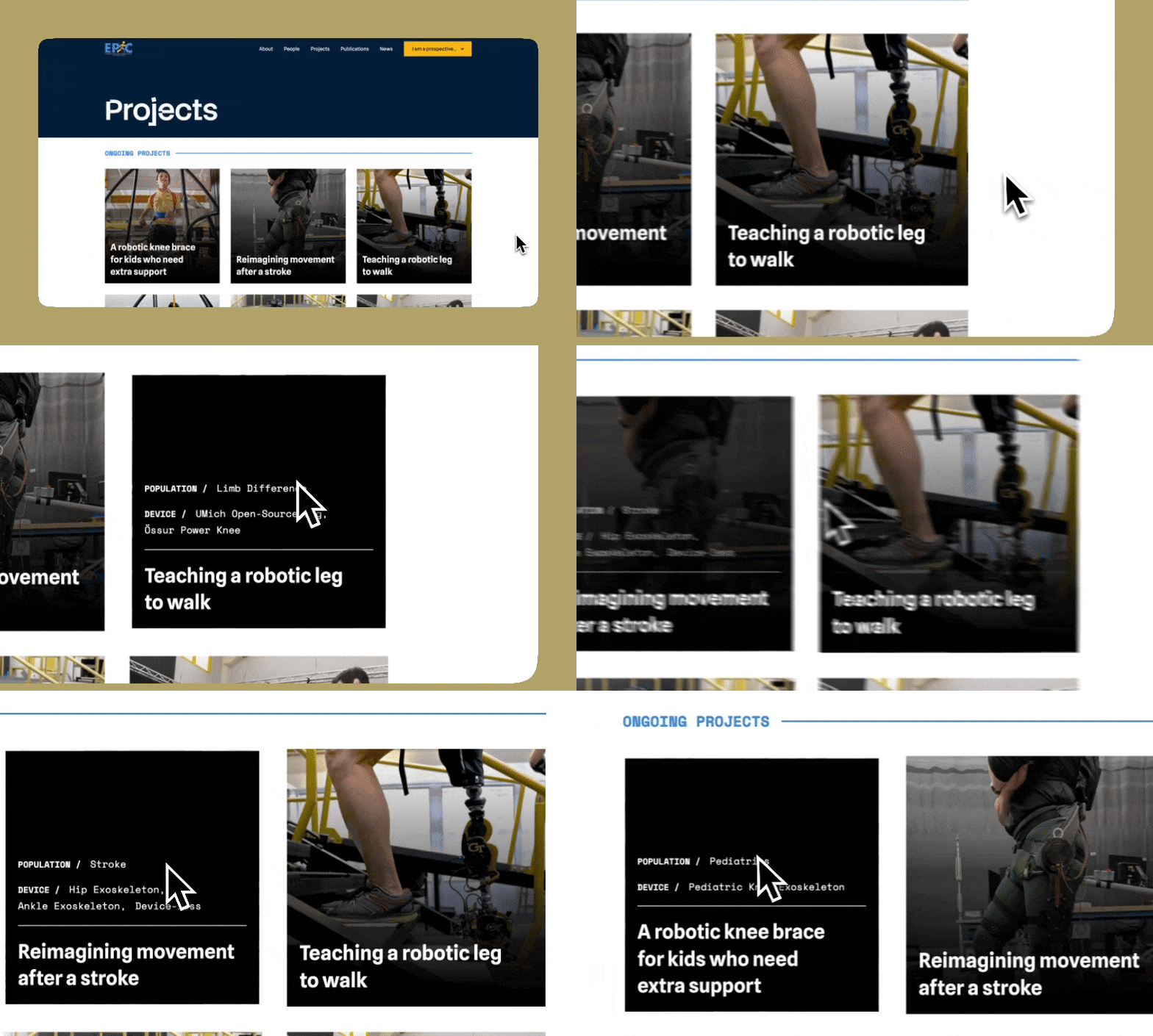
Project titles moved away from naming the device ("Powered Hip Exoskeleton," "Task-Agnostic Human Augmentation") toward more narrative-oriented descriptions of what the work does.
The population and device stayed accessible as tags on each card, so the specific terminology is still there for anyone looking for it.
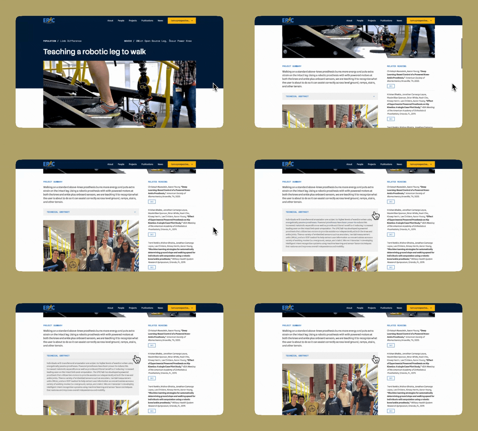
Project Summary vs. Technical Abstract
We debated whether to lead with the plain-language summary or the technical abstract. Prioritizing prospective research participants settled it: the summary comes first, and the technical abstract is shelved behind a click.
HANDOFF + WEB MANAGEMENT
Developing a more navigatable and manageable site
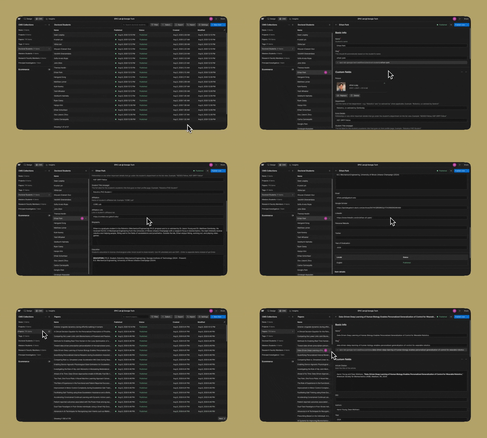
The most exciting part of the redesign was structuring the site around Webflow's content management system (CMS). It let me cross-reference everything, so a visitor could seamlessly navigate between a population EPIC serves, the projects and articles about it, and the students and faculty behind them.
Preparing for handoff
After the completion of the website, the role of managing site content would go to a doctoral student. I created page templates and CMS collections so that new content could be created by filling in the applicable fields and they'd never have to touch the Designer if they didn't want to.
FINAL SCREENS
Final screens
Homepage
Homepage
CLOSING
Thank you to EPIC!
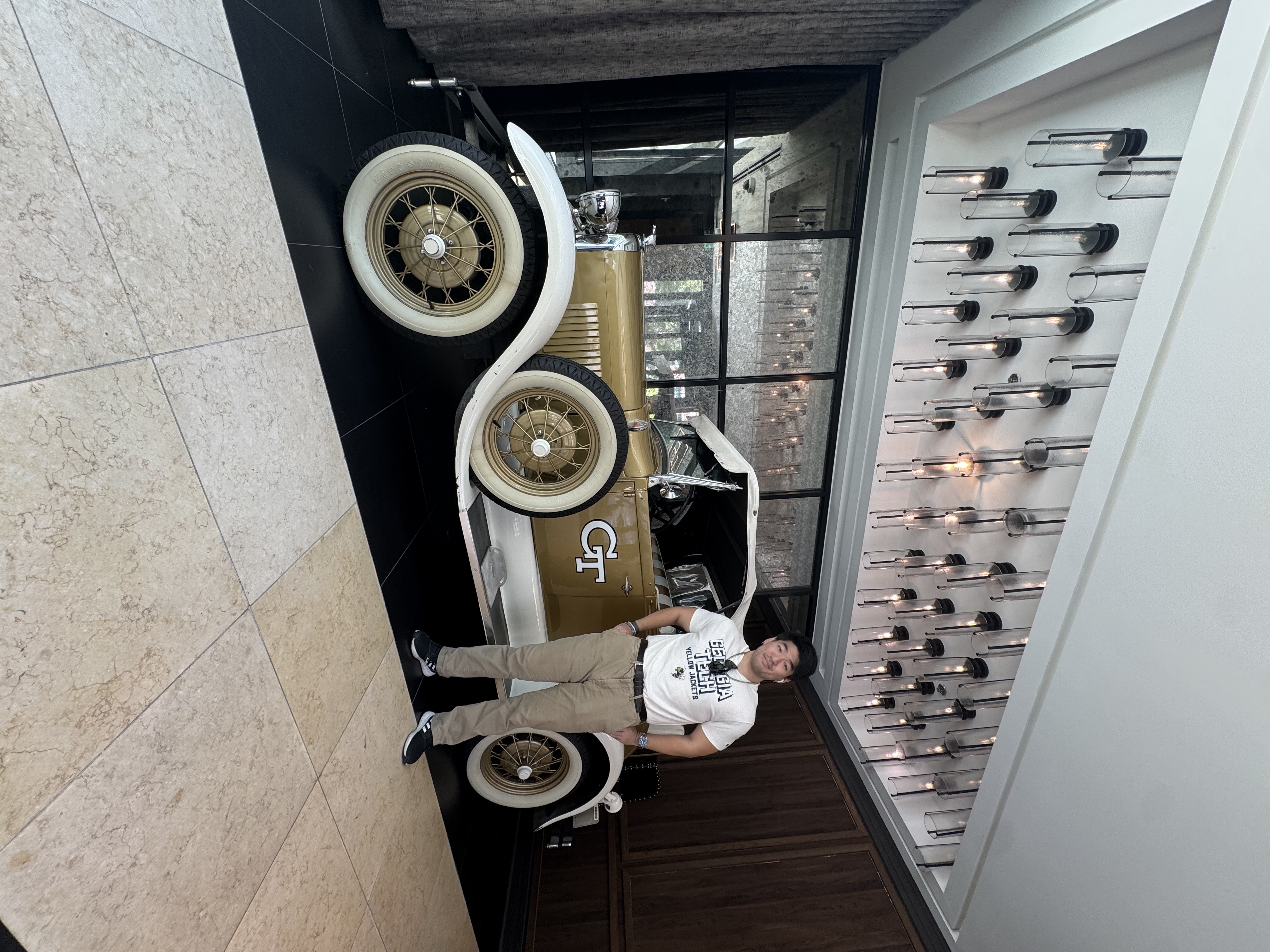
Thanks to Dr. Aaron Young and the whole EPIC Lab team for trusting me with this project! I'm grateful for the collaboration (and getting to visit the lab in person!) and looking forward to what comes next.
The site isn't live yet while EPIC works through the funding side of a long-term hosting arrangement, but the build is finished and waiting.